Uploads by Abratox
Jump to navigation
Jump to search
This special page shows all uploaded files.
| Date | Name | Thumbnail | Size | Description | Versions |
|---|---|---|---|---|---|
| 17:14, 21 September 2020 | Marvel's Spider-Man 20191017002511.jpg (file) |  |
121 KB | By showing Spider-Man as a lonely subject, as he climbs alone to the top of the highest buildings in New York, we can not only make him the focus of the image but also give the viewer a glimpse of his life and experiences. It also helps that he's surrounded by negative space and the golden light from sunset, and the use of the rule of thirds. | 1 |
| 17:13, 21 September 2020 | Horizon Zero Dawn™ 20200918160703.jpg (file) |  |
231 KB | The combination of orange sunlight and blue sky or water is a very common one to find and apply to images, and it works really well as it creates contrast. Contrast brings rhythm and layers to the image, and that in turn draws attention from the viewers. | 1 |
| 17:02, 21 September 2020 | Horizon Zero Dawn™ 20200918155225.jpg (file) | 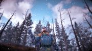 |
285 KB | By placing Aloy in front of a uniform background made of trees, we can create a contrast that brings the attention towards her. To reinforce this focal point, she is also placed on the lower third of the image, and the shallow depth of field keeps her from merging with the trees. This also keep the snowflakes visible, adding a new element to the atmosphere. | 1 |
| 17:00, 21 September 2020 | Horizon Zero Dawn™ 20200918153737.jpg (file) | 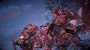 |
415 KB | Here a tension is created by the situation where Aloy is chased by a Sawtooth. What guides our eyes to the points of interest is the rule of thirds: she is aligned right on top of the right third line, and her face is in the exact intersection of the right and upper thirds. The use of a tilted camera creates diagonal lines on the background and between her face and the Sawtooth's face, adding tension and movement. (Horizon Zero Dawn) | 1 |
| 17:00, 21 September 2020 | Horizon Zero Dawn™ 20190317200351.jpg (file) | 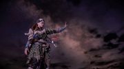 |
626 KB | In this scene Aloy is in front of a background that consists only of the night sky, making her the only subject present in the scene. The clear background makes it clear that she must be the focal point of the image. To add to that, she is placed on the left third line, which gives movement to the image. | 1 |
| 16:58, 21 September 2020 | Horizon Zero Dawn™ 20180129214334.jpg (file) | 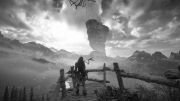 |
699 KB | Black and white photography can be very appealing. Not only for its history, but because it allows us to focus on the value of light, textures and shapes. In this situation, it allows us to see all the nuance created by the light on the rocks, clouds and mountains, and also makes the white snow all the more interesting. | 1 |
| 16:57, 21 September 2020 | FINAL FANTASY XV 20200920095850.jpg (file) | 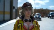 |
593 KB | Cindy's expression here is the main subject that was chosen to be photographed. We're not interested in the rest of her body, so the camera got closer to her, cutting out unnecessary detail from the image, leaving just enough background to show that she is in the auto station where she usually works. The shallow depth of field was also used to emphasize that she is where our attention should be. (Final Fantasy XV) | 1 |
| 16:56, 21 September 2020 | FINAL FANTASY VII REMAKE 20200419102536.jpg (file) | 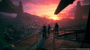 |
263 KB | In this scene from Final Fantasy VII Remake, the sunset creates a meaningful atmosphere as Cloud, Tifa and Barret watch the destroyed slums. The shades and the feeling of the ending day add up to a more dramatic scene, Also the composition is made of different depths and layers. | 1 |
| 16:55, 21 September 2020 | BATMAN™ ARKHAM KNIGHT 20190926193141.jpg (file) | 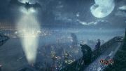 |
429 KB | The use of a high camera angle can give us an overview of Gotham City, and by adding the two characters we can glimpse into their points of view and realize how big it actually is, as the city disappears on the horizon. | 1 |
| 16:52, 21 September 2020 | BATMAN™ ARKHAM KNIGHT 20190926193046 1.jpg (file) | 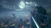 |
424 KB | As we see the balcony coming from the right side, we are introduced to the dialogue between Batman and the Joker who is pointing ahead, and then to all of Gotham at night. The lines from the foreground lead us towards the scene and creates depth. (Batman Arkham Knight) | 1 |
| 17:03, 19 September 2020 | Microsoft Flight Simulator AI light.png (file) |  |
18.38 MB | The Artificial Intelligence creates the light at night. | 1 |
| 16:50, 19 September 2020 | Fallout76 - Beautiful Sunset just otside the Vault.jpg (file) |  |
2.14 MB | As well as giving us the view from top of the hill which by itself creates the epic feeling, this shot has multiple planes in it's depth of field which gives us more tree dimensional feel and not just as a simple 2d image even if it is. There is unquestionably a details of Vault-Tec mark that is the only man made object across the shot that by itself creates a contrast between natural and man-made. | 1 |
| 16:50, 19 September 2020 | Far Cry Primal - Valley of the Bears - 10000BC.jpg (file) |  |
4.42 MB | The dramatic effect of this images come from the high trees and ridges that seem to cave us in and in a way pressure us to run toward the middle part of the image. Natural lightning gives us something we can corelate to, even though this is not a real shot of the nature. Additionally, there are a few details like the high tree in the middle as well as the white ones that give us the feeling of being in the "land of Gods". | 1 |
| 16:49, 19 September 2020 | No Man's Sky - Planet Resria-helix - Early morning.jpg (file) |  |
1.7 MB | As we've already discussed sometimes less is more. By having such a far depth of fieldd in this shot there are very few details we can see in the distance, pushing the viewer's eye toward the jaggy details of the palm looking trees located in the left part of the image. | 1 |
| 16:49, 19 September 2020 | Far Cry Primal - Entrance to the ancient Cave - 10000BC.jpg (file) |  |
4.61 MB | Following the rule of thirds, the focus is placed on the entrance to the cave, and the blue sky complements the warm tone of the torch and the cave itself with it's rough stone texture. Also there is a rule of subject position in the line of field, where these hanging branches create more plains of depth, so you have branches in the first plan, torch and pointy rock in the second and cave entrance and sky in the third. | 1 |
| 16:48, 19 September 2020 | Far Cry Primal - Cave of the first Settlers - 10000BC.jpg (file) |  |
3.09 MB | The natural cave-in and the walls themself push the viewers eye toward the center, naturally creating a vignette effect. Additionally, the rough and sharp stalactites give a stark contrast compared to warm and natural light of the fire. | 1 |
| 16:47, 19 September 2020 | No Man's Sky - Planet Resria-helix somewhere inbetween the stars.jpg (file) |  |
1.97 MB | Rule of thirds is applied in a most literal sence. The horizon starts and ends on the first horisontal line of the rule of thirds. The dust from the spaceship complements the clouds on the sky, as well as the clouds with their gentle texture complement the rough texture of the planet's flora. | 1 |
| 16:47, 19 September 2020 | Far Cry Primal - Moonlight on the Hillside - 10000BC.jpg (file) |  |
3.15 MB | It's important to know that sometimes less is more. By now, you've already seeing the benefit of the rule of thirds and how it adds more appeal to each shot. In this one we went a step further by reducing the general saturation of the shot, ontrodusing for for the dramatic effect while keeping the viewers eye focused on the moon as a rule of geometry contrasts. | 1 |
| 16:46, 19 September 2020 | Fallout76 - Greenery just North of the road 95A.jpg (file) |  |
7.3 MB | This landscape shot by itself has many details and natural well ballanced lightning. There is also a geometry shape of the sky and ground that complement each other. The horizon in this landscape is not in the center, but rather placed on the lower right half for the sake of more dramatic effect. | 1 |
| 16:45, 19 September 2020 | No Man's Sky - Planet Requiclon Anuri located in the same star closter as Resria-Helix.jpg (file) |  |
2.14 MB | This shot applies the rule of thirds, with the priority given to the sky as well as the hard accent on the planet rings on the left side. Blue colour has the priority above other colors. | 1 |
| 16:44, 19 September 2020 | Image 1 - Far Cry Primal - Mountain Hills - 10000BC.jpg (file) |  |
3.95 MB | This landscape team with natural and dramatic light of the sunrise, and by the rule of thirds, ground begins from the low left part of the shot and finishes on the right second line, basically making it a diagonal composition. | 1 |
| 16:18, 16 September 2020 | Spiderman 1.jpeg (file) | 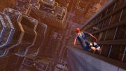 |
1.3 MB | Spiderman is leaping towards the ground, however he is positioned to the side because of an optical illusion. He is clearly aiming at the center of that street, but if we put him there, realistically he would overshoot that center by a lot. Having him on the side, like any motion story, tells us not where he is but where he will end up being. Twisting the angle of the shot above high-rise buildings gives a greater sense of vertigo. The depth of field tells us just how high Spiderman is. | 1 |
| 16:17, 16 September 2020 | HZD 2.jpeg (file) |  |
929 KB | Whenever you want to show size of an object, if the distance allows it, shoot it from below, as close to the ground as possible. That way an already big enemy like the one in this photo looks like it is towering over Aloy and that stomp that it is going for, would definitely crush her. In the same respect, with this angle we want to also show how small the other character is. Having the horizon that low also gives an almost infinite size feel to the enemy making him look larger than even the... | 1 |
| 16:17, 16 September 2020 | HZD 1.jpeg (file) |  |
1.7 MB | Horizon Zero Dawn We have separated our subjects to two different sides however the focus is on our main subject showing her action and emotions while having the enemy, in the background, clearly ready to attack her. Having that empty space in the middle of the photo, gives a good sense of distance between the characters. This With the camera so close to our character, the scene is more dynamic because we can clearly see actions of both subjects. | 1 |
| 16:16, 16 September 2020 | GranTursmo 4.jpeg (file) |  |
971 KB | In this shot we clearly want to show who is in the lead. Using the rule of thirds, the track begins in the upper left corner and ends in the lower right. That way you have a diagonal composition showing direction with motion blur, a sense of speed and depth of field shows exactly what the focus is on, attracting the attention of the eye on that. | 1 |
| 16:16, 16 September 2020 | GranTurismo 3.jpeg (file) | 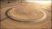 |
1.74 MB | When taking a wide-angle screen shot of an area, its important not to make the image look like it was shot in dead center. It will look too static and is something that is usually used in architecture but for action shots and movement, it is always preferable to have the photo shot from an angle, showing all the details of the terrain but clearly pointing to a specific direction. If the yellow car was moving in the opposite direction, this scene would be more pleasing to the eye if it was sho... | 1 |
| 16:16, 16 September 2020 | GranTurismo 2.jpg (file) |  |
2.25 MB | Adding motion blur gives a photo a sense of speed. By moving the camera back, this time the focus is on the upcoming track. Angled upward also means greater notion that the car is moving forwards. Another way to make the composition of a photo pop more is by adding complimentary colors for the two most obvious subjects. That way you have a clear separation and it is more pleasing to the eye. | 1 |
| 16:15, 16 September 2020 | GranTurismo 1.jpeg (file) | 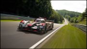 |
684 KB | For a sense of movement you can either position the camera in front or behind the car. In this example the composition of the car and its background is almost 50-50 in screen space. The car needs to be at a certain distance to make it look like its coming towards you and at the same time, show where its coming from. Playing with the perspective and tilting the image slightly gives a greater sense of speed. | 1 |
| 16:15, 16 September 2020 | Death Stranding 3.jpeg (file) | 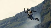 |
358 KB | Just as with vehicles, for character movements you need to position the camera at an angle that best gives away the sense of a leap towards something or somewhere. In this example our character is jumping off a cliff. By leaving the ground/landing zone invisible to the viewer, the composition gives a sense of a much higher jump than it actually is and by tilting the camera slightly downward, that accentuates the feel of a jump even more. | 1 |
| 16:15, 16 September 2020 | Death Stranding 2.jpeg (file) | 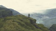 |
962 KB | In photography, the rules of thirds make the photo look more pleasing. Therefore it is not common to have items or subjects put in the dead center. In this example, having the character in the middle of the photo works perfectly because it is showing scale, just how large the world around him is. It also helps that due to the layout of the land, it is not a flat horizon but a more triangular composition giving also the depth to the image. | 1 |
| 16:15, 16 September 2020 | Death Stranding 1.jpeg (file) | 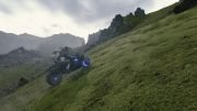 |
1.36 MB | Any time you want to show a sense of movement or speed you need to position the camera in the direction of the movement. It could be either in front, behind or at the side of character depending what story you want to tell. In this particular photo not only are we showing movement up a hill but the camera has been tilted slightly to show the viewer it is an uphill climb. It gives the image more dynamic feel rather than keeping it flat/horizontal. | 1 |
| 09:07, 22 August 2020 | World Of Warcraft - Durotar.png (file) | 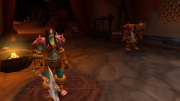 |
21.11 MB | Cave near the start. | 1 |