Viewpoint: Difference between revisions
Jump to navigation
Jump to search
No edit summary |
No edit summary |
||
| (2 intermediate revisions by the same user not shown) | |||
| Line 4: | Line 4: | ||
<div><ul> | <div><ul> | ||
<li style="display: inline-block; vertical-align: top;"> | <li style="display: inline-block; vertical-align: top;"> | ||
[[File: | [[File:GranTurismo_1.jpeg|thumb|none|500px|For a sense of movement you can either position the camera in front or behind the car. In this example the composition of the car and its background is almost 50-50 in screen space. The car needs to be at a certain distance to make it look like its coming towards you and at the same time, show where its coming from. Playing with the perspective and tilting the image slightly gives a greater sense of speed.]] | ||
</li> | |||
<li style="display: inline-block; vertical-align: top;"> | |||
[[File:Death_Stranding_3.jpeg|thumb|none|500px|Just as with vehicles, for character movements you need to position the camera at an angle that best gives away the sense of a leap towards something or somewhere. In this example our character is jumping off a cliff. By leaving the ground/landing zone invisible to the viewer, the composition gives a sense of a much higher jump than it actually is and by tilting the camera slightly downward, that accentuates the feel of a jump even more.]] | |||
</li> | </li> | ||
</ul></div> | </ul></div> | ||
Latest revision as of 16:40, 16 September 2020
Scale of the Scene and position the camera to include a subject in the scene allows a viewer to relate the size of your composition. In doing so, your image pops and is much more interesting.
Example
-

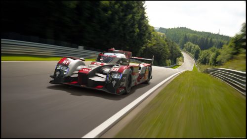
For a sense of movement you can either position the camera in front or behind the car. In this example the composition of the car and its background is almost 50-50 in screen space. The car needs to be at a certain distance to make it look like its coming towards you and at the same time, show where its coming from. Playing with the perspective and tilting the image slightly gives a greater sense of speed. -

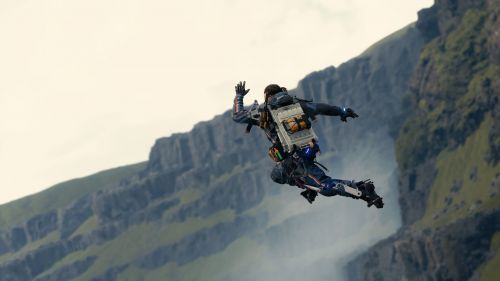
Just as with vehicles, for character movements you need to position the camera at an angle that best gives away the sense of a leap towards something or somewhere. In this example our character is jumping off a cliff. By leaving the ground/landing zone invisible to the viewer, the composition gives a sense of a much higher jump than it actually is and by tilting the camera slightly downward, that accentuates the feel of a jump even more.